Leading UX for Scopus
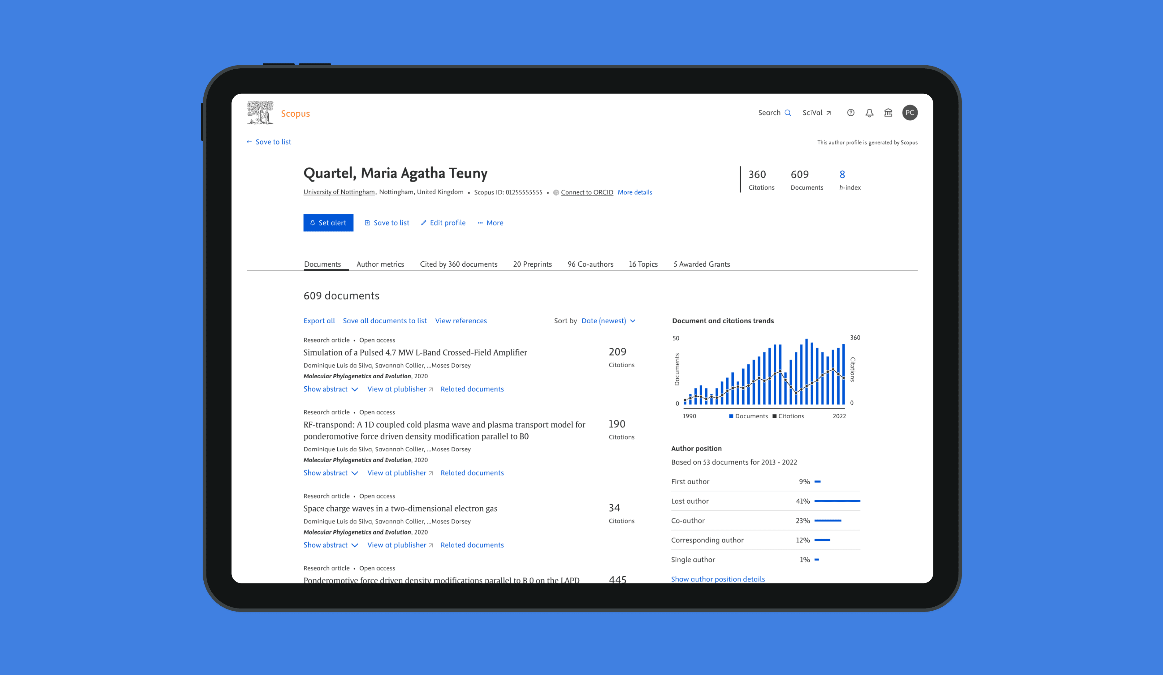
As UX Design Manager, I'm responsible for the user experience of two flagship products within Elsevier (part of RELX). One of the products is Scopus, which is a worldwide market-leading abstract and indexing platform for academia and governments.
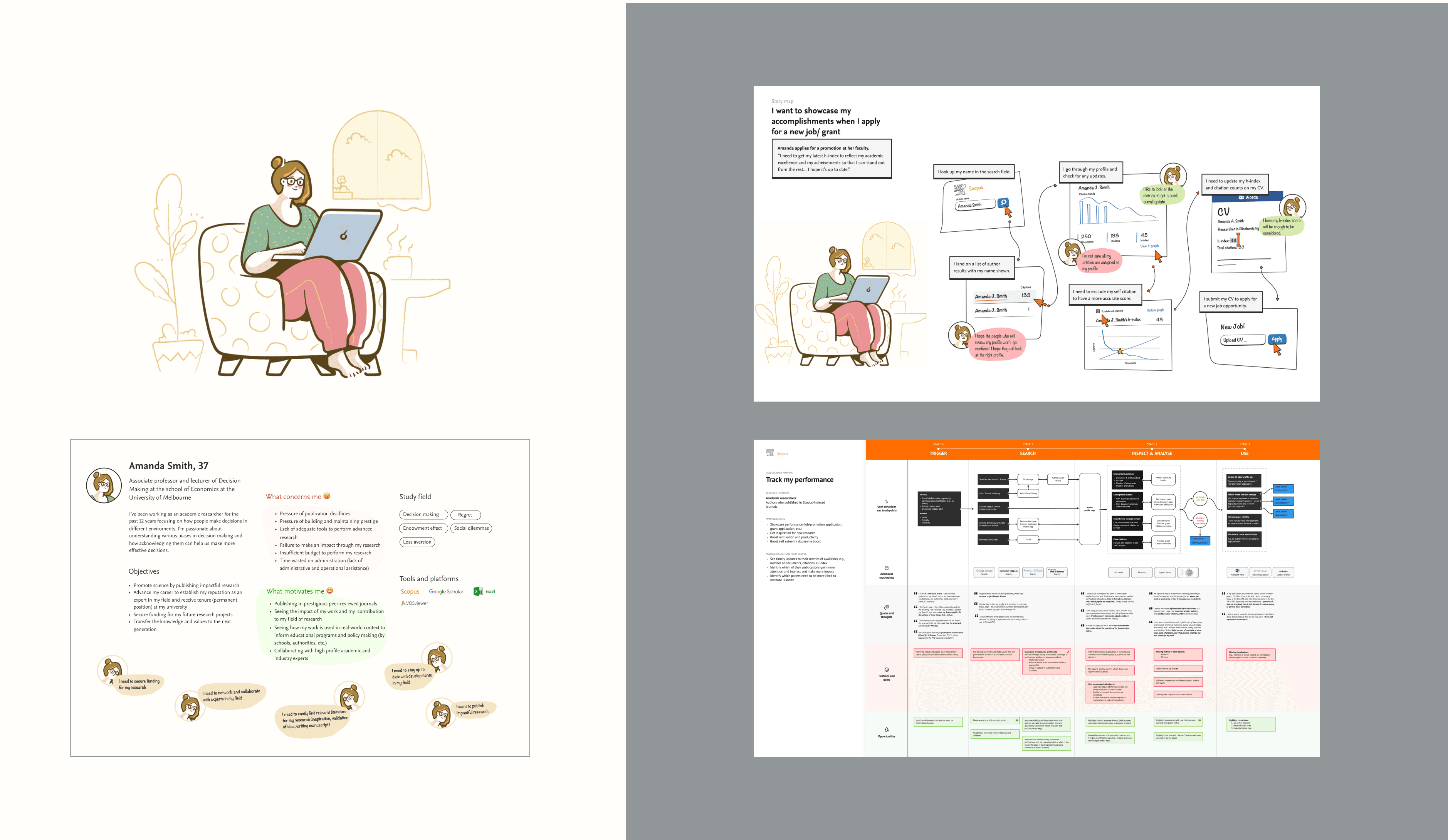
Over the past 5 years, I launched various key initiatives to increase the UX maturity, such as: a UX strategy, UX metrics, detailed persona's, journey maps, a replatforming strategy.
As well, I had the opportunity to build a brand new multidisciplinary UX team of 9 highly skilled people in Amsterdam.
My role:
UX Design Lead and Manager
Team:
7 UX Designers, 2 Researchers, 1 Copywriter
Period:
September 2019 till Present
Key projects and activities
In the past years, I had the opportunity to work on several impactful team activities that significantly improved our product and team dynamics.
UX Strategy, Vision and Roadmap
To enhance our user experience, we focused on understanding our users deeply. We developed detailed personas of our core users and meticulously mapped out their journeys through our product. This understanding allowed us to establish clear UX metrics and Key Performance Indicators (KPIs), driving user-centric improvements and aligning our product development efforts with user needs.
Additionally, we worked on a replatforming strategy in collaboration with the product and technology teams, ensuring we could replatform the product in a way that maximized user value.
UX Advocacy
To foster a user-centered culture within Scopus, we initiated a monthly event called Scopus User Day. During these events, developers, product managers, UX professionals, and any interested colleagues can interact directly with actual users. This hands-on interaction helped bridge the gap between our users and our internal teams.
In my role as UX Design Manager, I became part of the management team based on the Silicon Valley Product Group (SVPG) model. This ensured that the user's voice was represented in both the long-term and short-term roadmaps and in critical product decision-making. Additionally, we made it a practice to track and share UX metrics regularly during week starts and in our monthly product and UX town halls. This transparency helped keep the entire team aligned and informed about our UX progress.
Design System
To mature the digital experience in the platform to the next level, I build a Design System from the ground up together with a multidisciplinary team, such as: Front-End developers, Accessibility experts, CSS experts, Product Management, and our Creative Director. As well, we worked on processes to add, enhance, and/or remove components from the Design System.
With help of the Design System we are able to be more efficient, accessible, and consistent within our products.
Team Building
I had the opportunity to build a strong, multidisciplinary UX team in Amsterdam, consisting of design, research, and copywriting experts. In total, my team is containing 6 UX designers, 1 copywriter, and 2 UX researchers.
Our focus was on developing both hard and soft skills within the team. To support this, we created a structured framework for self-development and added processes for team activities like Design Critiques, UX week starts, week planning, and lightning talks. This structure not only improved our workflow but also fostered a collaborative and growth-oriented environment.


